
An OKR dashboard is a single view that shows whether your Objectives and Key Results are on track, who owns each one, and how confident the team is about hitting the target. If you’re starting from scratch, three formats earn their place immediately: a strategy map for alignment, a KR visualization panel for execution detail, and a personal focus dashboard for individual accountability. Templates and a scoring walkthrough follow below.
TL;DR:
- Using a small number of dashboards focused on alignment, execution, and individual accountability improves clarity and reduces complexity for teams.
- Automated data feeds from analytics, CRM, or project tools ensure dashboards remain current and trustworthy, especially for larger or field teams.
- Prioritizing fewer Objectives and monitoring confidence levels provides early warning signs that prompt timely interventions, rather than waiting for progress to confirm issues.
- Decimal scoring from 0.0 to 1.0, averaging across Key Results, standardizes achievement measurement and highlights underperforming areas for discussion.
- Tailoring dashboard formats to company size and industry, and limiting manual updates, enhances usability and sustained value.
Six OKR dashboard examples worth copying
Most teams only need a handful of dashboard formats, not a dozen. Here are the six that cover alignment, execution, and individual focus without overbuilding.
- Strategy map. Shows how company-level Objectives connect to team-level ones. Widgets: a tree or hierarchy chart, color-coded status per branch. Data needed: objective titles, parent-child relationships, current status. Best for quarterly leadership reviews.
- Cascading map. A deeper version of the strategy map that traces a single Objective down through two or three organizational layers. Widgets: nested progress bars, owner tags at each level. Use it when a company goal has stalled and you need to find which team is the bottleneck.
- Plan overview. A flat list of every active Objective with percent complete and status. Widgets: a table with sortable columns. Good for a monthly all-hands where speed matters more than depth.
- KR visualization panel. Breaks a single Objective into its Key Results with progress bars, trendlines, and target-versus-actual markers. Widgets: sparklines, gauge charts. This is where execution risk actually surfaces, since a KR can stall while the Objective still looks fine on a summary view.
- Personal focus dashboard. One person’s KRs only, filtered from the team view. Widgets: a short list, a confidence tag. Useful in one-on-ones and weekly check-ins.
- Status and health panel. A traffic-light summary across every active Objective, sorted by risk. Widgets: red/yellow/green tiles, a trend arrow. This is the one leadership actually opens first.
Strategy maps and plan overviews reveal alignment gaps. KR visualization and status panels reveal execution risk. For data sources, a spreadsheet works fine at first; as teams grow, connecting analytics tools, a CRM, or a project tracker keeps the numbers from going stale between updates.
What every OKR dashboard needs to include
A dashboard is only as useful as its weakest field. Before you build or buy one, check it against this list.
- Objective summary: a one-line statement of the goal, not a department name.
- KR tiles: percent complete, current value, and target value side by side.
- Owner: a named person, not a team, for every Key Result.
- Confidence or forecast: a simple high, medium, or low tag showing whether the owner believes the target will be hit.
- Supporting KPIs: context metrics that explain the “why” behind a stalled KR.
- Timeline: days left in the cycle, visible on every view.
Sparklines and traffic-light colors do more work than raw numbers because they let a reader judge health in under three seconds. A target-versus-actual bar does the same job for a single KR without forcing anyone to do mental math.
Pro Tip: Put the confidence tag next to the percent-complete number, not below it. Teams respond faster to a dropping confidence score than to a slowly moving progress bar, since confidence catches trouble before the numbers do.
Good OKR dashboards surface confidence or forecast alongside percent-complete so the team can see not just where things stand, but whether anyone actually believes the target will be hit. For more patterns on visualizing status and KPIs together, see this collection of KPI dashboard examples.
Keep the data connected automatically where you can. A dashboard that depends on someone remembering to update a spreadsheet by Friday will eventually show numbers from three weeks ago, and nobody will trust it after that happens twice.
Ready templates by team: marketing, product, engineering, operations
Copy these into a spreadsheet or dashboard tool and adjust the targets to your own numbers.
- Marketing. Objective: grow qualified pipeline. KRs: increase website traffic, raise marketing-qualified leads (MQLs), improve conversion rate on the top landing page. Widgets: traffic trend line, MQL funnel, conversion rate gauge. Sample marketing OKRs commonly track traffic and MQLs as the core supporting metrics, which map directly onto these widgets. See a full template at marketing OKRs with cadence guidance.
- Product. Objective: improve activation. KRs: raise trial-to-paid conversion, reduce time to first value, cut churn in month one. Widgets: funnel chart, cohort retention table.
- Engineering. Objective: ship faster without breaking things. KRs: increase deployment frequency, reduce open bug count, cut mean time to resolution. Widgets: deployment frequency bar chart, bug count trendline.
- Operations. Objective: tighten process reliability. KRs: reduce fulfillment errors, cut average response time, raise on-time delivery rate. Widgets: error rate line chart, response time gauge.
Fields to populate each widget usually come from the tool that already owns that data: analytics for traffic, a ticketing system for bugs, a CRM for conversion. Aggregate weekly for team dashboards and monthly for leadership summaries. Hide raw ticket counts and granular bug lists from leadership views. They need the trend, not the backlog.
How to score OKRs with decimal scoring
Most teams that score OKRs at all use a decimal scale from 0.0 to 1.0 per Key Result, then average those scores to get the Objective score. The method, popularized by Google and explained in detail by WhatMatters, treats 1.0 as full achievement and 0.7 as a strong, honest outcome rather than a failure.
Here’s a worked example using three Key Results under one Objective:
- KR1 scores 0.8
- KR2 scores 0.6
- KR3 scores 1.0
Add the three scores (0.8 plus 0.6 plus 1.0 equals 2.4) and divide by three. The Objective score is 0.8.
Decimal scoring standardizes end-of-cycle reflection and gives dashboards a clean numeric signal to trend over time. Display it as a single number on the Objective tile, with a small trendline showing the last two or three cycles, and flag anything under 0.6 for discussion at the next review.
Setting up cadence, ownership, and check-in rules
A dashboard is a living document, not a slide you build once per quarter. Set these rules before you launch it.
- Real-time for operational metrics that feed automatically from analytics or CRM tools.
- Weekly for team-level OKR progress, updated before the check-in meeting, not during it.
- Quarterly for formal scoring and the retrospective conversation about what the numbers actually meant.
Each Key Result needs one named owner responsible for updating it. In the weekly check-in, review only Key Results that changed status or confidence since the last meeting, not the full list every time.
Pro Tip: Cap the dashboard at six to eight widgets per view. Dashboards fail less from bad data and more from too many tiles competing for attention.
The most common failure mode is a dashboard nobody updates because updating it is manual and tedious. Automate the feed wherever you can, and if you can’t automate it, assign the update as a calendar task, not a mental one. For a structured approach to setting this rhythm, see this guide to OKR cadence planning.
What we’ve seen work and what doesn’t
Across the teams we’ve worked with, three patterns repeat. Start with one Objective dashboard, not five. Automate updates before adding more widgets.
Our training for managers running OKR check-ins walks through this in practice.
Connecting OKR dashboards to your other tools
An OKR dashboard built in isolation becomes stale fast. The fix is connecting it to the tools where the real data already lives, rather than asking someone to retype numbers every week.
Business intelligence tools like Looker or Tableau can pull KR values directly from a data warehouse, which works well once a company has enough data volume to justify the setup. For smaller teams, connecting a project management tool such as Asana, Jira, or Monday is usually faster: deployment counts, ticket closures, and task completion rates flow into the dashboard without manual entry.
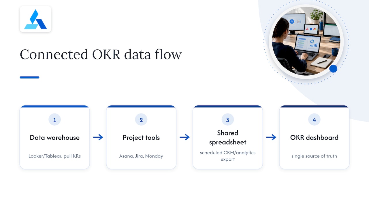
The integration doesn’t need to be complex. A shared spreadsheet with a scheduled export from your CRM or analytics platform covers most mid-sized teams. What matters is that the number on the dashboard matches the number in the source system at all times, since a mismatch is the fastest way to lose a team’s trust in the whole exercise.
Avoid connecting too many sources at once. Pick the two or three systems that feed your highest-priority Key Results first, get those pipelines solid, and expand from there. A dashboard with five reliable integrations beats one with twelve unreliable ones.
How different companies actually use OKR dashboards
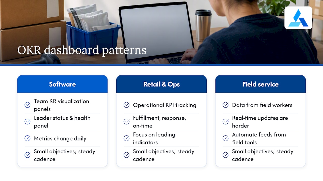
The format that works depends heavily on company size and industry. A fast-growing software company tends to lean on KR visualization panels at the team level and a status and health panel at the leadership level, since engineering and product metrics change daily and leadership mainly needs the red, yellow, green summary.
Retail and operations-heavy businesses often favor dashboards closer to operational KPI tracking, where fulfillment accuracy, response time, and on-time delivery sit next to the OKR tiles rather than replacing them. This piece on dealership KPIs that predict profit shows how a vertical with tight operating margins builds its dashboard around a small number of leading indicators rather than a long list of vanity metrics, a pattern that holds for other operations-heavy businesses too.
Field service and distributed operations teams face a different challenge: the data often comes from people working outside an office, which makes real-time updates harder. Approaches built for field service dashboards and guidance on tooling for distributed teams both point to the same fix, which is automating the data feed from field tools rather than relying on end-of-day manual entry.
Across industries, the common thread isn’t the specific widgets. It’s that the companies getting real value from OKR dashboards keep the number of tracked Objectives small and the update cadence consistent.
The template obsession misses the real problem
Most advice on OKR dashboards focuses on which widgets to use, and that’s the easy part. The harder problem, the one that actually sinks most dashboards, is that teams set too many Objectives and then build a dashboard elaborate enough to track all of them. That’s backwards. A dashboard should be a forcing function for focus, not a container for everything a team hopes to get to this quarter.
The conventional advice to “track confidence alongside progress” is right, but it undersells why: confidence is the leading indicator, and progress is the lagging one. If you only build one habit from this entire piece, make it this: when confidence drops, treat it as the trigger for a conversation, not the progress percentage. Teams that wait for the percent-complete number to confirm trouble always find out too late to fix it within the cycle.
Prioritize fewer Objectives, automate the boring parts of data entry, and resist the urge to add a widget just because a tool makes it easy to add.
FAQ
What are some good OKR examples?
Strong OKRs pair a qualitative Objective with measurable Key Results, such as a marketing Objective to grow pipeline paired with KRs for traffic, MQLs, and conversion rate. IBM’s guidance on OKR scoring lists sample Objectives across marketing, product, and development that map cleanly onto dashboard widgets.
What are some examples of performance dashboards?
Common performance dashboard types include strategy maps for alignment, KR visualization panels for execution detail, status and health panels for quick risk scanning, and personal focus dashboards for individual check-ins. Each format serves a different viewer, from leadership to an individual contributor.
Is Google still using OKR?
Google popularized the decimal scoring method many companies still use today, scoring each Key Result from 0.0 to 1.0 and averaging those scores into an Objective score. Public details on Google’s current internal practices aren’t publicly listed, but the scoring method it popularized remains the industry standard referenced by WhatMatters.
What is an OKR vs a KPI?
An OKR is a goal-setting framework pairing a qualitative Objective with a small set of measurable Key Results tied to a specific time period. A KPI is an ongoing metric used to monitor the health of a process, and dashboards often show KPIs as supporting context alongside OKR progress rather than as the goal itself.